
by Jennifer Kohlhepp | CM Magazine Cover Story
Beyond Black: Expanding Ceramic Card Possibilities

By Jennifer Kohlhepp, Managing Editor, ICMA
For years, ceramic payment cards have been defined largely by one color: black. The dark, high-gloss finish helped establish ceramic as a distinctive option in the premium card market, but advances in material formulation and manufacturing are beginning to expand what card designers can achieve with the material.
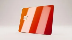
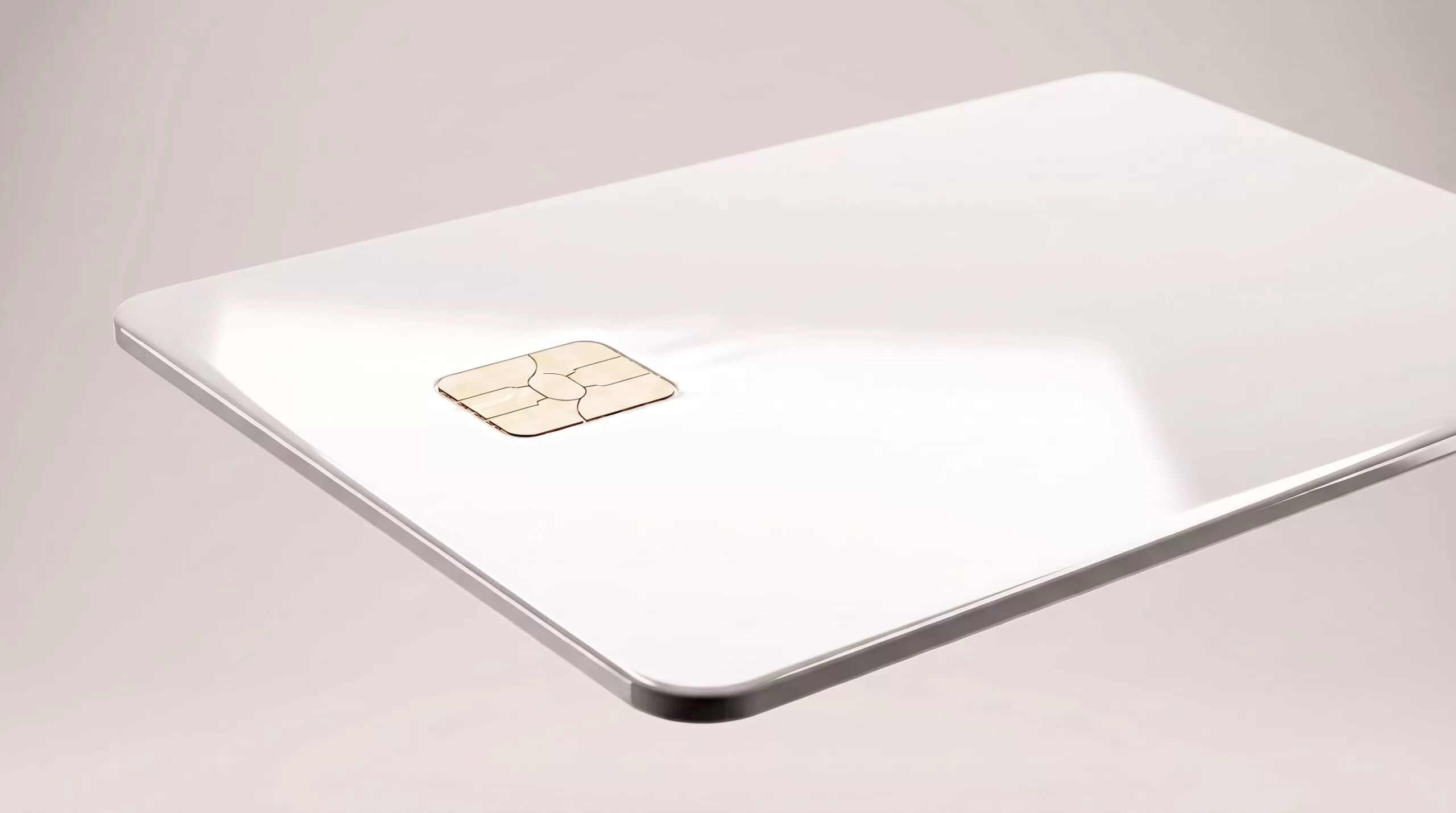
Giesecke+Devrient (G+D) is extending its Convego Ceramic payment card portfolio with new colors, including white, bright blue and deep red, along with the ability to produce a broader range of shades. The development illustrates how materials science, manufacturing precision and card design are converging as issuers seek new ways to differentiate physical cards.
For card manufacturers, however, adding color to ceramic is considerably more complex than simply changing an ink or applying a different coating.
“The technical challenge starts with the fact that ceramic color is created in the material itself, not added afterward, as it would be with a printed layer or coating,” said Mikko Kähkönen, Head of Payment Cards Portfolio at G+D. “That makes the move beyond black much more demanding than it may look at first glance.”
Building Color Into the Material
Unlike conventional card decoration, where inks, coatings or other treatments can be applied to the surface, ceramic coloration begins with the composition of the material itself.
During production, ceramic materials are subjected to high-temperature firing. Many pigments cannot withstand that process consistently, potentially fading or changing tone. Lighter and more expressive colors can require different compounds, stabilizers such as zirconium and tighter control over the production process.
Dark, oxide-based colors have historically been more common in ceramics in part because they can be more predictable during firing. Moving beyond those shades requires manufacturers to control the composition and behavior of the material from the earliest stages of production.
“With ceramic, you’re not working on top of the card; you’re working inside it,” Kähkönen said. “That means controlling material behavior throughout the full production cycle. From a manufacturing perspective, that shifts quality control much earlier in the process.”
That difference changes the way manufacturers approach color consistency. In a printed card, quality control can focus heavily on factors such as registration, surface appearance and whether the finished design meets established specifications. With ceramic, manufacturers must also determine whether the material was formulated correctly and behaved chemically as expected during firing.
Once the card leaves the kiln, its color is already part of the ceramic body. There is no subsequent printing step that can correct the underlying shade.
Achieving stable and repeatable colors at production scale therefore requires specialized processes and precise control over materials and firing conditions. The payoff is the ability to introduce colors that have traditionally been difficult to achieve in ceramic.
“We can produce a wide range of colors,” Kähkönen said. “For example, the dark red and bright blue are a pleasure to look at.”
Combining Material and Decoration
Creating additional ceramic colors also gives card designers a broader foundation on which to apply other decorative techniques.
Laser engraving can introduce fine details and textured patterns, while electroplating can add additional colors and reflective effects. In electroplating, a thin metallic layer is deposited onto the ceramic surface, creating another visual dimension without eliminating the underlying character of the ceramic.
“Engraving brings texture and fine detail, while electroplating can add a second or even third color and create reflective effects,” Kähkönen said. “So, the creative range is broad, but close coordination is needed between design and manufacturing.”
That coordination is particularly important when multiple manufacturing and finishing processes are combined. Instead of treating material selection and card artwork as separate stages, ceramic can require designers and production teams to consider how the material, color, engraving and metallic effects will work together from the beginning.
For manufacturers and issuers, these combinations open additional opportunities for personalization and product differentiation within premium card programs.
Ceramic and Metal Offer Different Premium Experiences
Ceramic enters a premium card market in which metal and metal-composite constructions have already given issuers alternatives to conventional plastic cards. Rather than simply replicating the experience of metal, ceramic offers different physical and visual characteristics.
Both materials use weight to create a sense of substance. According to Kähkönen, ceramic can in many cases be heavier than metal. Yet the sensory experience differs.
Metal communicates weight, coolness and solidity, while ceramic emphasizes surface depth, reflectivity and a refined finish. The materials also create different sounds when placed on a hard surface, adding another subtle sensory element to the cardholder experience.
Where ceramic is especially distinctive is its surface. G+D’s ceramic construction uses zirconia to help produce a highly polished, reflective appearance while also contributing scratch resistance. The material is designed to retain its high-gloss surface while resisting fingerprints and the wear associated with repeated handling and movement in and out of a wallet.
“Its high-gloss zirconia surface can look almost like a dark mirror: deep, precise and exquisitely reflective, with a level of finish that feels closer to fine jewelry than to a conventional payment card,” Kähkönen said.
The comparison between ceramic and metal also reflects a broader development in premium card manufacturing. Rather than selecting one premium material for an entire customer category, issuers can increasingly use materials, finishes and designs to distinguish among different customer segments.
“Banks are no longer building premium programs for one narrow private-banking audience,” Kähkönen said. “They are segmenting more carefully, using different materials to match different affluent and aspirational personas rather than relying on one premium format for everyone.”
The Physical Card as a Brand Touchpoint
The expansion of ceramic colors comes as banks face growing competition from fintechs and digital-first financial providers. According to McKinsey, fintechs’ combined share of revenue among the world’s largest banks and fintech companies increased from approximately 10% in 2021 to 17% in 2025.
That growth has implications beyond digital functionality. As fintechs compete for broader customer relationships, traditional institutions are looking more closely at how products, experiences and brand identity can help attract and retain affluent and aspirational customers.
Physical cards can play a role in that strategy precisely because so much of banking has moved to digital channels.
“Payment cards are not only valuable to customers but also to banks,” Kähkönen said. “They are increasingly treating the physical card as one of the few tangible brand touchpoints they still fully own, especially as more of the everyday banking relationship moves into apps and digital channels.”
For premium programs, this gives materials and card construction greater strategic importance. Weight, texture, finish, color and personalization can communicate aspects of a brand that are difficult to reproduce through a purely digital interaction.
Kähkönen sees this as one reason alternative card materials will continue to evolve.
“Physical cards are becoming more selective and more strategic,” he said. “The card is still the most visible and most frequently handled connection between a bank and its customer.”
More Materials, More Opportunities
The development of colored ceramic illustrates a larger shift in card manufacturing. Material choice is increasingly becoming part of the design language itself rather than simply the substrate beneath a printed graphic.
Ceramic, metal, metal composites, recycled materials and other emerging constructions each provide different combinations of visual, tactile and performance characteristics. For manufacturers, the opportunity lies not only in developing those materials but also in expanding the colors, finishes, personalization techniques and production capabilities that can be used with them.
Ceramic’s move beyond black is one example of how advances in materials science can broaden the designer’s palette while creating new manufacturing challenges. Achieving consistent color requires careful formulation and process control, but it also creates new possibilities for combining color with engraving, metallic effects and other decorative techniques.
As issuers become more deliberate about matching physical cards to particular customer groups, those capabilities could become increasingly important. Instead of defining premium cards through a single material or aesthetic, the next phase of card design may be characterized by a wider range of materials and finishes selected to create distinctly different experiences.
For ceramic, expanding the color palette is a step in that direction.